Key Takeaways
- Clear hierarchy helps employees and visitors understand where to go, what each area does, and how spaces connect.
- Designers can signal importance through circulation, proportion, lighting, materials, glazing, and joinery without overusing walls.
- Strong office plans give prominence to business-critical activities while keeping support functions accessible and discreet.
- Good planning should consider accessibility, team behaviour, client journeys, change, and everyday movement.
Introduction
A well-designed office should make sense before anyone explains it. Reception should feel like an arrival point, meeting rooms should be easy to find, and work areas should be reachable without crossing client zones. This clarity begins with spatial hierarchy. We use it to decide what deserves prominence, what supports it, and how transitions make the workplace easier to read.
For us, a workplace is not a collection of rooms. It is a sequence shaped by people, tasks, privacy, and movement. Strong spatial organisation gives those relationships structure. Whether you are planning a headquarters, studio, or professional office, the aim is an environment that adapts as teams evolve.
What Is Spatial Hierarchy?
Spatial hierarchy is the deliberate ordering of workplace areas by importance, purpose, and relationship. We identify primary spaces such as reception, client meeting rooms, town-hall zones, or collaboration hubs. These may occupy visible positions and use lighting, distinctive finishes, or clearer architectural framing. The aim is to show where attention and activity should gather.
Secondary spaces support daily operations. Workstations, smaller meeting rooms, touchdown points, and breakout areas need connection to primary zones without competing with them. Print points, storage, utilities, and service access should remain convenient yet visually quieter. Hierarchical planning becomes practical when we test adjacencies, sightlines, privacy, acoustics, and frequency of use.
A successful plan also considers how different people experience and use the workplace. Singapore’s Ministry of Manpower (MOM) workplace design guidance explains that workplace design can support inclusiveness by encouraging interaction and considering the needs of different employee groups. For offices, that means hierarchy should make movement and access clear while ensuring important spaces remain practical and comfortable for the people who use them.
Why Well-Organised Offices Feel More Natural to Use
People read a workplace quickly. They notice where routes lead, whether destinations are visible, and whether a space feels public, collaborative, focused, or private. Good spatial hierarchy reduces the interpretation required. Visitors can reach meeting rooms without wandering through workstations, while employees reach shared resources without crossing quiet zones.
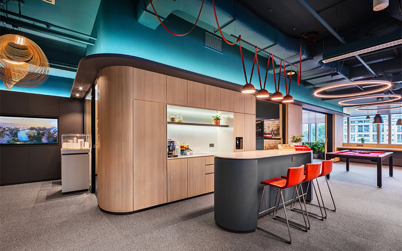
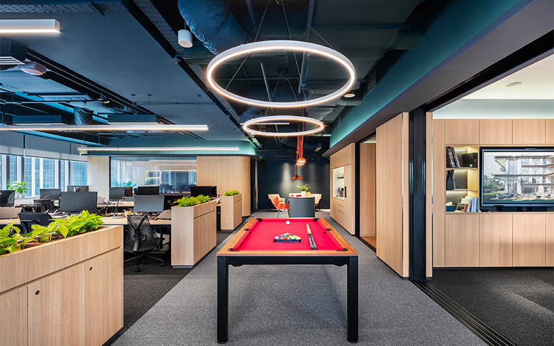
This affects concentration and comfort. We separate high-activity zones from areas requiring sustained focus, then use transition spaces to manage the change in energy. A pantry beside a collaboration hub may encourage interaction, while focus rooms sit deeper within the plan. The office feels calmer because office spatial planning reflects real behaviour instead of forcing every activity into the same visual and acoustic condition.
Clear organisation also strengthens confidence. Predictable routes help you spend less effort figuring out how to use the environment. Clients experience a more controlled arrival. Teams understand where spontaneous discussion belongs. Leaders gain a workplace that supports culture through use rather than slogans. Together, these effects influence how considered an office feels.
Applying Spatial Hierarchy Through Office Design
We combine operational analysis with architectural decisions. We look at who uses each area, how often, what privacy is required, and which journeys happen most. When you work with an office interior designer in Singapore, these patterns should be translated into a coherent plan rather than a collection of attractive rooms. At concept stage, we also challenge assumptions about which spaces truly need visibility, enclosure, or proximity. That prevents hierarchy from becoming a styling exercise and keeps planning tied to operational needs and user journeys.
Create Distinct Zones Using Architectural Cues
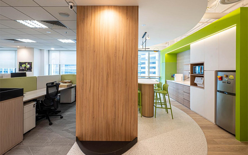
Walls are only one way to define importance. We can use ceiling height, lighting, flooring transitions, glazing, joinery, and material shifts to signal where zones change. In reception, a ceiling feature or crafted backdrop can establish presence. A central collaboration space may use open sightlines and distinctive lighting. These cues help occupants recognise the purpose and prominence of different zones without fragmenting the office.
The key is restraint. If every zone has a feature ceiling, contrasting floor, statement light, and different palette, nothing stands out. We choose cues according to purpose and reinforce them consistently. Premium craftsmanship matters because detailing should clarify the spatial idea, not decorate it afterwards. For commercial interior design in Singapore, the strongest results come when architecture, branding, and daily function support the same workplace logic.
Prioritise Circulation Around Everyday Movement
Circulation should reflect real routines, not only the shortest line between doors. We map recurring journeys from reception to meeting rooms, workstations to collaboration spaces, staff areas to pantries, and teams to shared resources. Primary routes should feel obvious and suit expected traffic. Secondary paths can serve quieter areas without becoming shortcuts.
This study reveals conflict points before construction. A print station outside a focus room, a pantry queue across a walkway, or visitors crossing secure areas can create daily friction. When providing commercial interior design services in Singapore, we examine these dependencies early because finishes cannot correct poor circulation.
Match Space Prominence to Business Priorities
Not every function deserves equal visual weight. We ask what your workplace needs to communicate and enable. If client engagement is central, reception and meeting spaces may deserve more presence. If collaboration drives delivery, shared team zones may become central. If confidentiality matters, private rooms and controlled transitions may need greater emphasis.
Here, spatial hierarchy becomes a business tool. We align prominence with operational value, then use proportion, position, visibility, materials, and access to reinforce that choice. The result should feel natural: important activities are easy to find, support functions stay close, and the office expresses business priorities through use.
Conclusion
If your office feels difficult to navigate or disconnected from how your team works, more signs or decorative features will not solve the issue. The relationships between spaces need reconsideration. At Good View Interiors, our commercial focus includes office, retail, and F&B environments. We can help you define the right hierarchy, test circulation and adjacencies, and create an office that supports your people, clients, and growth.
Contact us to discuss how we can plan a clearer, more intuitive workplace around the way your business operates.